Dallas R. Trinkle
Research Group
Grace (xmgrace)
Obtaining Grace
Grace can be downloaded from the Grace homepage.
Introduction
Grace is a powerful 2D plotting tool with a very clean interface. It can output to multiple file formats (.eps, .pdf, .png). It is the easiest and best tool to produce 2D plots for presentation and publication.
The Grace user guide and tutorial are good starting points to learn the basics of using Grace.
Typesetting
\n	new line
\u	begin underline
\U	stop underline
\o	begin overline
\O	stop overline
\q	begin italics
\Q	stop italics
\s	begin subscripting
\S	begin superscripting
\N	return to normal style
\x	switch to Symbol font
\f{}	return to normal font
\c	begin using upper 128 characters of set
\C	stop using upper 128 characters of set
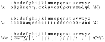
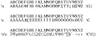
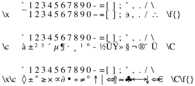
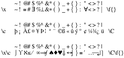
Grace is able to typeset a limited amount of symbols through changing the font:


Figure Setup Suggestions
Plot choices
Line choices
Please remember that a line through your data points is not always needed. For certain types of plots, the “None” line type is the appropriate choice.
The default line width is 1, this is okay for informal printouts. However, for publication and presentations, I recommend a line width between 3 and 5. Line width can also be used to differentiate between data sets. However, I recommend keeping the line width consistent in a plot unless special attention needs to be brought to a certain data set or if a data set is sufficiently different from all others.
Color choices
 | Grace offers a wide variety of default colors to use. Please do not use them all. From the default set, I suggest using black, red, blue, orange, and green4 for presentations. |
 | Colorblindness may be something else to consider. It certainly makes it more complicated since there are different types of colorblindness. You can use this site to do a quick check of colors if you need to. |
Overall, I don't recommend too many colors, and I certainly don't recommend putting a full rainbow into any plot. Of course, you can also add in your own colors (RGB format) by editing the .agr file. It's near the top of the file, “@map color”. Custom colors that seem okay are:
@map color 0 to (255, 255, 255), "white"
@map color 1 to (0, 0, 0), "black"
@map color 2 to (0, 70, 170), "blue2"
@map color 3 to (0, 150, 50), "green2"
@map color 4 to (255, 180, 0), "orange2"
@map color 5 to (100, 0, 100), "maroon2"
Symbol choices
The symbol size is very dependent on what you want to show. I don't think there is a general suggestions. You should look over the plot to see if the size is appropriate for the medium (Paper, presentation, or other).
I recommend using filled symbols and unfilled symbols with width of 2 or 3. As with the line style, it is not always necessary to use a symbol for each data set. If you are using both a symbol and a line for a data set, I recommend using the same color for both.
Font choices
The default Times-Roman should be a good font for almost all plots. The main suggestion is to use a font size that is appropriate. The default “char size” is 100, this is not large enough if you want to shrink the plot down for publication or for use in a presentation. For a square plot of 8“ by 8”, I suggest a “char size” of 150 for publication figures (shrinking down to 3“ width). For presentations, I suggest 175 or even 200.


